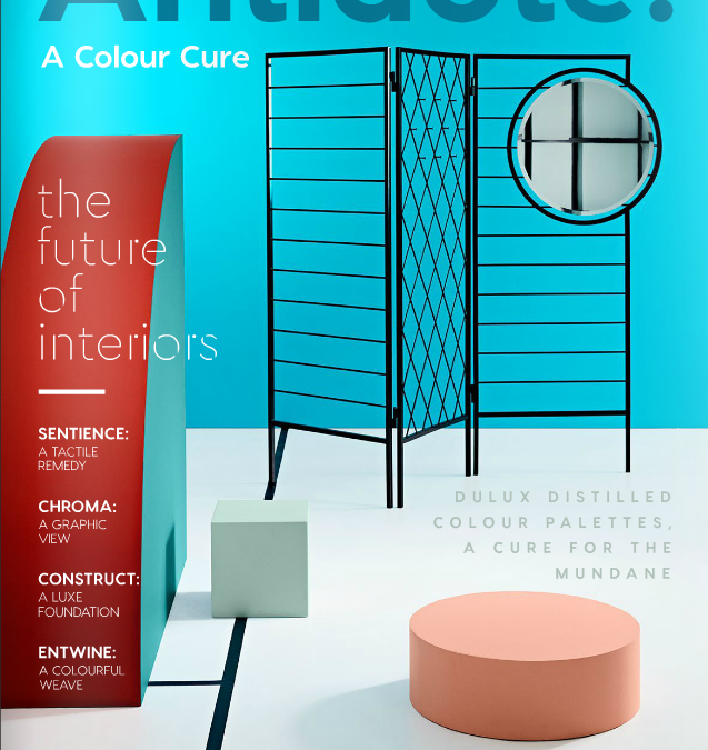
September is traditionally the time of the year when the paint companies, interior design magazines and the Heimtextil Trendtable release their colour and trend forecasts for the next 12 to 18 months. In this post, I am going write about the Dulux Colour Forecast Antidote - A Colour Cure, which was presented during the Sydney Design Festival at an event hosted by the Design Institute of Australia (DIA) last week.
Additionally, you can listen to the interview with Andrea Lucena-Orr, Colour Planning & Communications Manager at Dulux Group, which I recorded after the event in the beautiful showroom of Space Furniture in Alexandria. Andrea talks about the four colour trends and shares her tips how to introduce colour to a smaller home or apartment.
In a world which is dominated by technology and where being busy seems to be the new norm, Dulux prescribes colour as the recipe to create harmony, juxtapose the gloss and shine of technical devices with tactility, rawness, and organic materials and find balance and connections in our private life. As Andrea pointed out in her presentation, about 30 per cent of the colours in each palette are new colours. Antidote - A Colour Cure is the overarching theme for the four Dulux colour trends in 2017. So, if you feel your colour scheme at home is antediluvian, check out these hot and trendy hues.
1. SENTIENCE - A Tactile Remedy
2. CHROMA - A Graphic View
3. ENTWINE - A Colourful Weave
4. CONSTRUCT - A Luxe Foundation
Let’s have a closer look into the world of each palette.
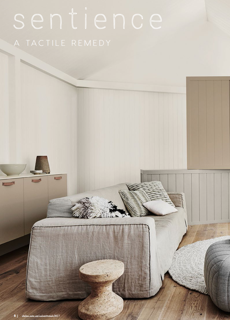
1. SENTIENCE - A Tactile Remedy
Sentience is all about textures and tactility. The beauty of different textures around your home – think of woollen rugs, linen sheets, knitted throws, macrame wall hangings, silk cushions, timber tables, stone benches, handmade ceramics – and experiencing the sensation when touching these surfaces.
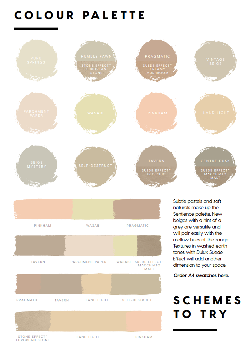
The palette is a combination of soft, warm colours, skin tones and vegetal hues including stone and suede effects for textured walls. Relax in this neutral and soothing colour scheme and add some natural energy with greenery and pot plants. Another trend that proved to be very popular in commercial applications – vertical gardens – is making its way into our homes.
2. CHROMA - A Graphic View
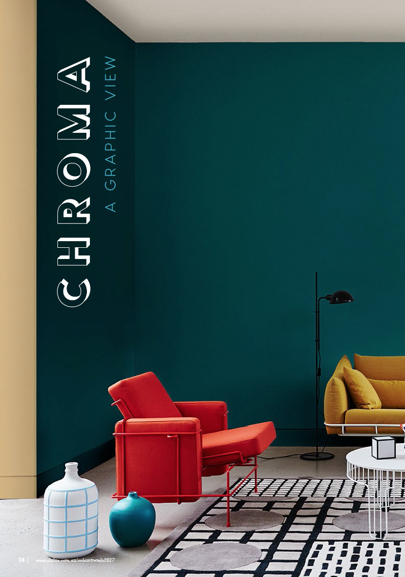
This palette is not for the faint-hearted. Express your personality with striking saturated colours, go bold with strong black lines, graphic patterns, geometric shapes, round edges – be inspired by the Bauhaus style. Dull was yesterday. Black lines are an important design feature in this trend – think furniture with black edges, black handles or tap ware, black stripes in paint applications or on your rug. Contemporary art with block colour and strong line work complement this look.
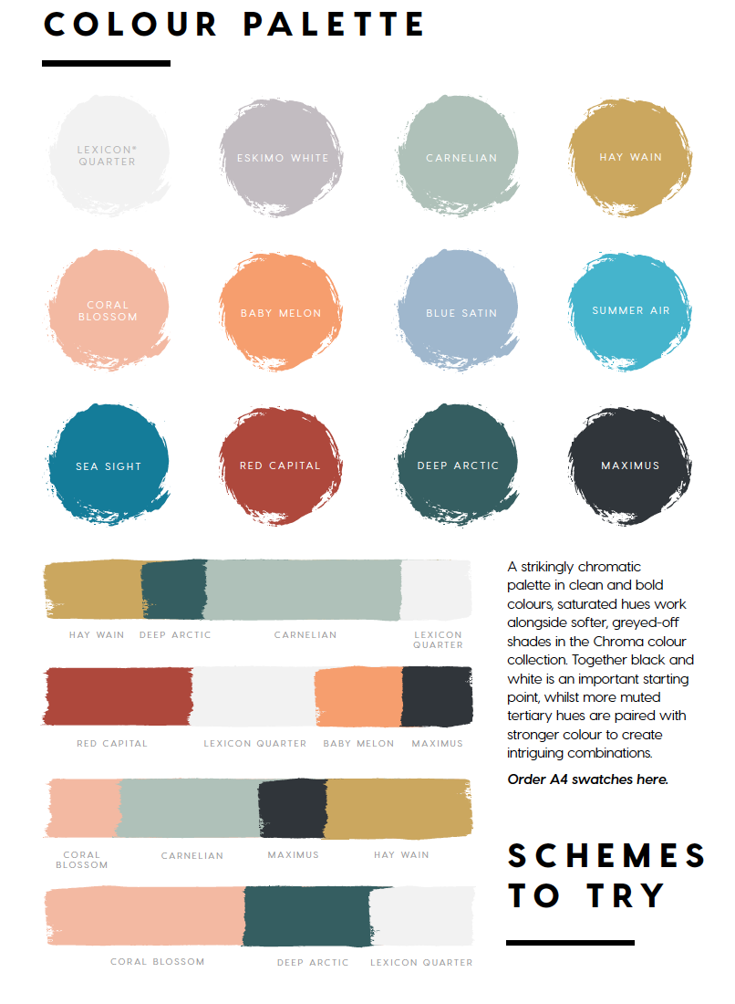
Embrace a stunning chromatic colour palette for the confident home decorator with black and white as a starting point embracing blues, greens, and mustard as well as more muted tertiary hues.
3. ENTWINE - A Colourful Weave
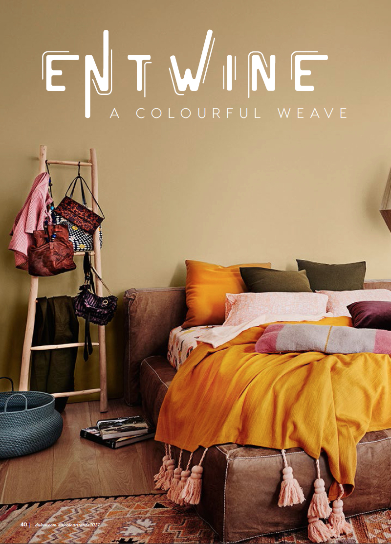
Globalisation is progressing with a fast pace. In Australia, we live in a multicultural society with many nationalities and their cultural heritage merging. To interact with different cultures and create a dialogue between tradition and modernity, the simple act of weaving seems to be recurring a symbol of connectedness. Weaving can be found in many societies and represents a way of connecting, interlacing, entwining.
If you love eclectic interiors, this trend could be the right thing for you. Entwine mixes and matches styles and elements from different cultures with woven features as the recurring element. Think of rugs, lamps, baskets, wicker furniture, wire sculptures, coloured glass with a woven pattern, pouffes, cushions, and fabrics with woven textures.
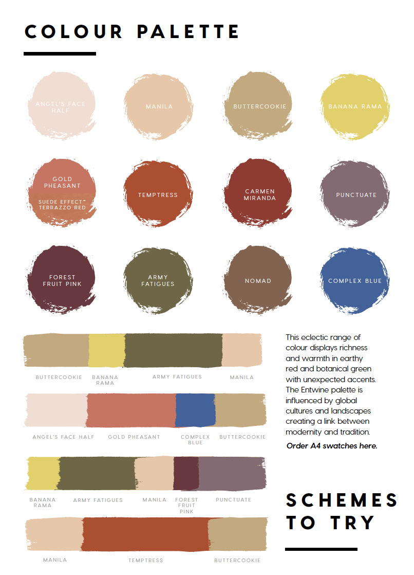
The colour palette is warm and bright celebrating diversity in style with earthy red, army green, browns and pinks and featuring Complex Blue as unexpected surprise.
4. CONSTRUCT - A Luxe Foundation
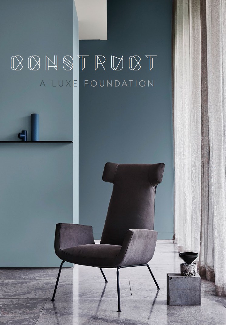
If you feel at home in interiors with raw and authentic materials and love the geometric shapes of the Bauhaus style, Construct might be your trend to follow. Think of Bauhaus-inspired beauty derived from luxury, structure and form meets industrial materials, such as concrete, glass, and steel.
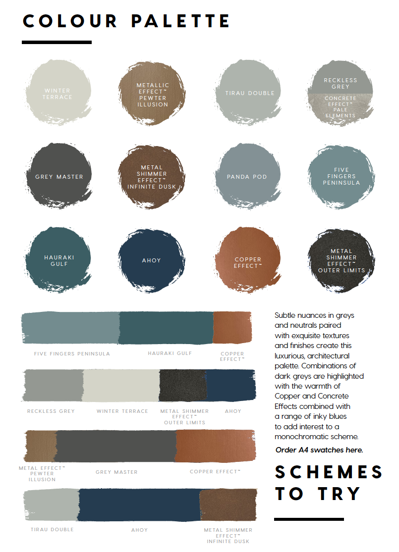
In this rather cool, sophisticated palette of blues and greys, metal hues and finishes add warmth and shimmer. The rich, deep inky-blue Ahoy effectively contrasts the lighter tones of grey, concrete and steel and creates a luxurious interior when combined with copper or gold effects. However, to create interest in this very monochromatic scheme, it is vital to master the art of layering textures.
To read more about these colour trends and to see examples of how you can introduce them into your home, browse the brochure Dulux Antidote - A Colour Cure.
What are your favourite colours, and to which trend can you relate most? Share your comments below.
If you need help with incorporating the new colours into your home contact me to book a colour consultation. You will save time and money in the long run.
The next trend post will invite you into the world of Explorations – the colour and soft furnishing trends compiled by an international group of designers for the Heimtextil Theme Park 2017.
All images courtesy of Dulux.



A Graphic View, those colour were Very bold and it would be fascinating to see rooms like this popping up next year. Thanks for the tips and colour schemes, it will definitely help to keep things in order for the coming year:)